We’re sharing a sneak peek at the visual design of the upcoming release of
Snikket’s Android app - what we’ve changed, why, and how we got here. The new
app will be released on 25th January 2026. To learn more about using Snikket
for your communication, check our homepage.
The foundational principles of good user interface design never really change.
People should be able to easily find common actions, text should be clear and
legible, buttons should be large enough to press, to name a few. But around
these pillars, aesthetic conventions are always shifting and evolving.
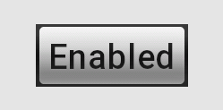
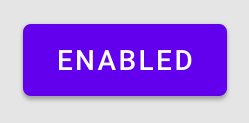
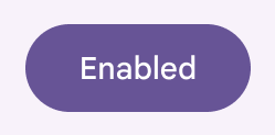
Android 2009
Android 2014
Android 2026
Years ago, square corners used to be lauded as “crisp”. Today, rounded
edges are marvellously “smooth”. Where shadows used to add a three-dimensional
realism to our interfaces, flat designs are now the norm in most apps.
One of Snikket’s goals is to be approachable and familiar to people who are
used to other popular messaging ecosystems. It should be a welcoming gateway
to the world of decentralized messaging. This means, where reasonable, keeping
up with the conventions established by other widespread communication apps. We
can’t stand still.
Snikket’s Android app has been looking increasingly out of place in recent
years, compared to the rest of the apps on a typical Android phone. A
large reason for this is the shift towards Google’s Material design -
the latest design framework that Android uses, and provides to developers, to
help with the design, colours, typography and user interface controls in applications.
For the next release, the Snikket app has been updated to Material 3. This is
largely thanks to the work done by Daniel on the upstream Conversations app
which underlies the Snikket Android app. On top of the work in Conversations,
we have put a Snikket spin on the new interface, aligning it with our colours,
and making adjustments to various elements to ensure the design feels familiar,
friendly and accessible.
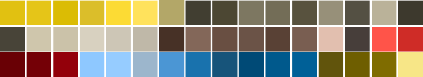
A sample of our updated colour palette
While our brand colour remains our iconic yellow, we have designed a new
colour palette for this release. This is derived from Material 3 guidelines,
with assistance from the ever-helpful folk at Superbloom,
plus a custom-built utility to ensure excellent colour contrast across all our
new colours and ensure sufficient legibility.
Speaking of colours, the app now also supports “Material You”, which is a
feature of modern Android that allows apps to adapt to a user-chosen colour
scheme or wallpaper image without sacrificing usability. If enabled in the
settings, Snikket will automatically follow your system’s dynamic colour
scheme.
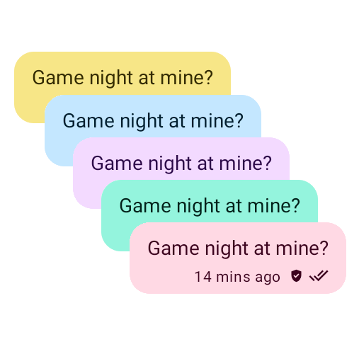
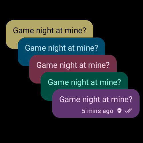
Chat bubbles can now follow your system theme colours
…in both light and dark mode
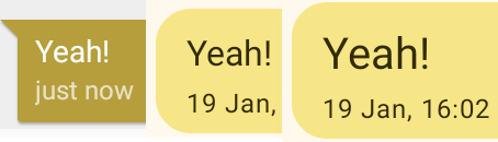
Chat bubbles have been given additional space to more clearly separate
individual messages, and default font sizes have been slightly increased.
These changes were made after carefully reviewing the interfaces of other similar
messaging apps. The goal is to allow anyone to feel as “at home” when using
Snikket as they would any other app on their device.
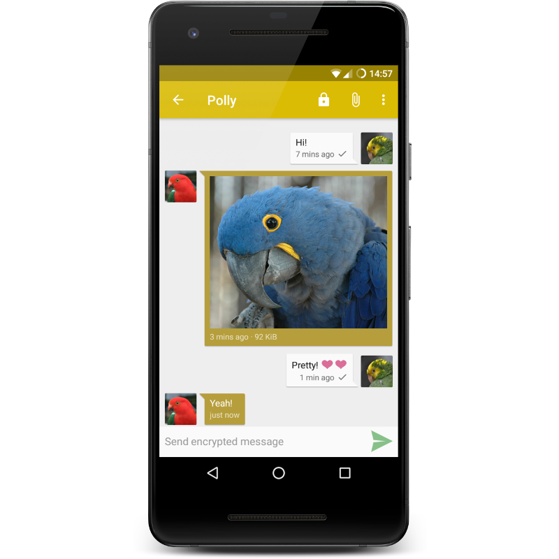
The original Snikket Android
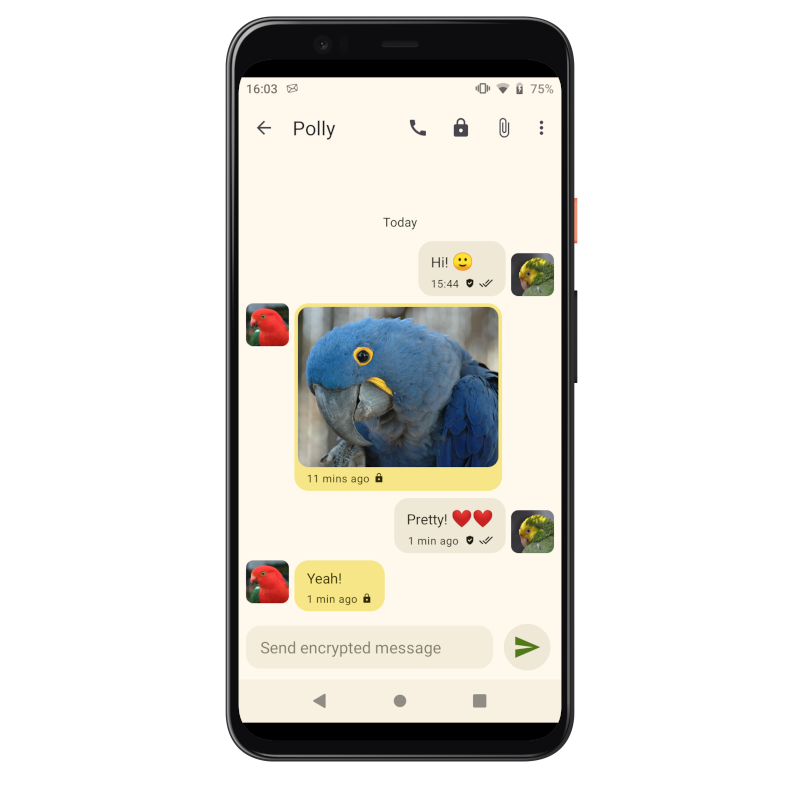
The new Snikket Android
Snikket continues to follow the system font preferences as in the past, but
during our research we found our default font size was slightly smaller than
other messaging apps we compared with. Our default size now matches what other
similar apps use, and an in-app setting allows you to further boost the font
size of messages in case you just need that little bit of extra clarity in
your chats.
Old font size, new size, and optional extra large size
We hope that each aspect of the new design helps people feel even more at home
when using Snikket. The new release will be available on the 25th January!